

Note: There is a rating embedded within this post, please visit this post to rate it.Android 7.0 Nougat is very much official and running on some devices already, so let’s dream about the future iteration. Some say we’ll be dealing with a case like Jelly Bean, with Android 7.1 and 7.2 being the next releases, but I don’t believe that. So today we dream of Android 8.0/Android O.

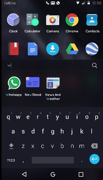
Created by Vijay Designer from India, the OS is supposed to make it easier to access app elements and improve user experience. First of all, we have a brand new lockscreen, that feels elegant and a bit “pretentious” so to say, a bit snob-ish. There’s that pill area that focuses on the shortcuts accessible from the lockscreen. Then we have a breakthrough, because of the fact there’s no app drawer and instead all the apps are on the homescreen, like the Chinese editions of Android or … iOS.

The dock apps always remain at the bottom and the keyboard seems to have been modified a bit, at least color-wise. Quick Settings have been tweaked and separate even further, while icons like the User and Quick Settings themselves seems to have switched to a narrower font. Notifications seem to get more room now, although their font is kind of skinny…
The aspect I like the best is actually this dropdown area. Not sure about the crowded homescreen, though…

[via Behance]