
Note: There is a rating embedded within this post, please visit this post to rate it.Vlado Ivankovic had previously created an iPhone 8 concept that was met with mixed feelings by our readers. Now he used the same template to come up with a HTC One M10 concept, that’s more about the UI than the actual device design.

The design is asymmetrical here, with a wider front top speaker and a narrower front speaker at the bottom. This model adopts an edge to edge approach and a black/white/gray UI approach, with very minimalistic symbols. I find the font used by the designer interesting and somehow it reminds me of the one used in the Mission Impossible title screens, so it’s not exactly well suited for a smartphone.
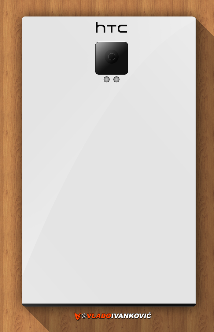
The back doesn’t stray very much from what Samsung and HTC are offering right now, with a big camera, that at least doesn’t protrude very much. Back to the UI, the font is a bit too rounded for my liking, but the whole transparency and minimalism of it all may work… Be sure to check out the rest of the designer’s UI renders.
[via Behance]