This Windows 12.2 concept by AR 4789 sits at the intersection of sleek industrial design and thoughtful UX experimentation, and while it looks futuristic, it raises questions about practicality. Let’s break it down from both perspectives.
The concept leans heavily into a “containerized” design language. Icons, widgets, and even apps sit inside card-like modules with subtle borders. This creates visual consistency and reduces clutter, especially in the Start menu where pinned apps and widgets feel more approachable than Windows 11’s floating grid. The File Explorer redesign also benefits from this containerized look, with clear segmentation of folders and photos, enhanced by soft transparency effects. While this adds clarity, it could risk redundancy—too many borders and cards may end up overwhelming the eye rather than simplifying the experience.
Animations and transitions are another UX highlight. Windows opening and closing with smooth fades and slides make the OS feel modern, and closer to what you’d expect from premium Linux distros like KDE Plasma. However, Microsoft has historically struggled with balancing flashy effects with system performance—especially on lower-end hardware. If such transitions were optional and performance-aware, they could be a welcome upgrade.

Industrial Design
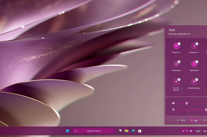
Visually, the concept emphasizes minimalism and translucency, echoing modern hardware aesthetics—think glass, brushed metal, and lightweight ultrabooks. The purple-toned control center in the mockups suggests a tighter marriage between hardware and software branding, much like Apple’s macOS. Even the settings panel and quick toggles feel like they were designed with touch devices in mind, with large tappable areas and flat, neon-accented icons. This shows sensitivity to hybrid devices (2-in-1s, tablets, laptops), where Windows often struggles with UI scaling and touch friendliness.
The consistency of rounded edges, layered translucency, and adaptive themes shows a clear nod to industrial design principles: harmony, visual rhythm, and tactile clarity. The result is an OS that feels like it belongs on next-gen devices rather than being retrofitted onto legacy machines.

The Bigger Picture
As with many concept videos, the risk is style over substance. Organizing everything into containers looks neat but may reduce information density for power users who rely on compact, information-rich UIs. And while transparency-heavy design is visually striking, it often raises accessibility concerns for users with visual impairments or those working in bright environments.
via neowin
Recent comments