In an era where smartphones chase complexity like an arms race, Keziah Mendjisky proposes a radical counter-move: subtraction. His unnamed concept—an ultra-minimalist “connectivity brick”—looks almost defiant in how much it refuses to participate in contemporary smartphone tropes. No glossy slab of glass. No camera island sprawling like a sci-fi tumor. No infinite scroll. Instead, Mendjisky imagines a device boiled down to its purest interactions: call someone, hear them, maybe send a quick message, and walk away.
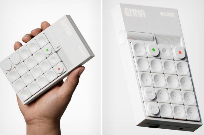
From afar, this object feels closer to a premium calculator than a communication device. Its geometry is unapologetically cubic, the face is a grid of pillowy, concave keys, and the whole thing is rendered in a monochrome, matte white palette that would make Dieter Rams nod in approval. But pick it up and the illusion dissolves: the keypad layout is unmistakably telephonic, with numbers beginning at the top rather than the calculator-standard bottom. Two circular buttons—one green, one red—instantly communicate their purpose. Even before you power it on, your hand intuitively recognizes the logic.

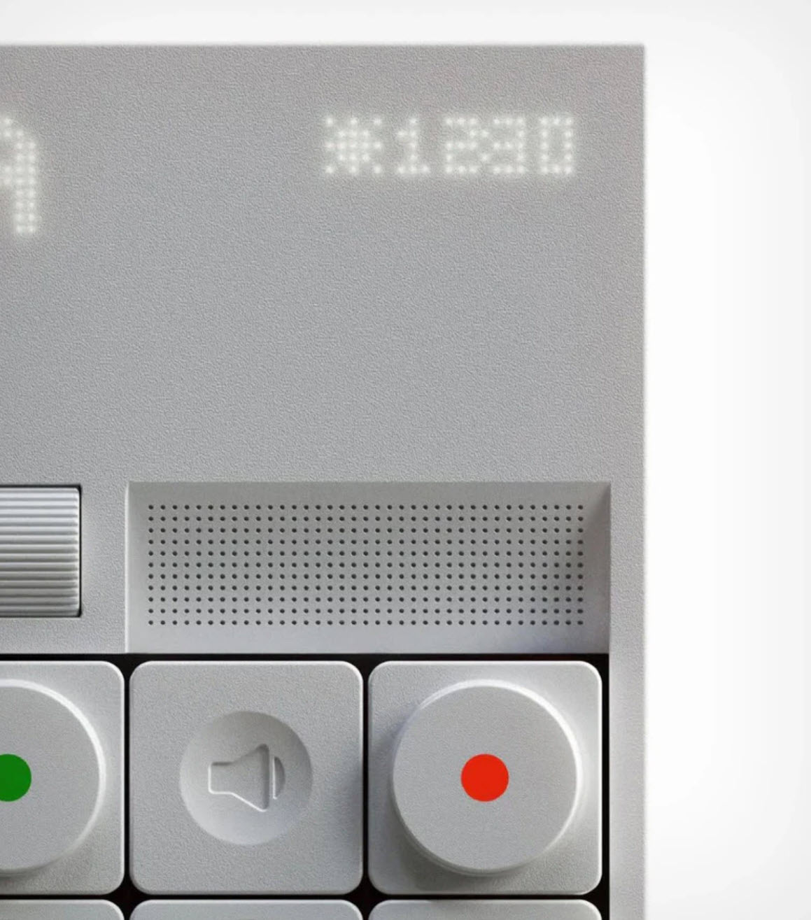
The real pivot in Mendjisky’s philosophy is the screen… or rather, the lack of one. Instead of a fragile full-color display, he integrates a backlit plastic panel with a dot-matrix readout. It glows softly, almost like the text you’d find on an Ember mug or a minimal IoT board, providing only the essentials: the name of the contact, a piece of media, the time, the temperature. By stripping away the visual noise of modern UI design, Mendjisky redefines attention, nudging the user toward a more deliberate relationship with their device.
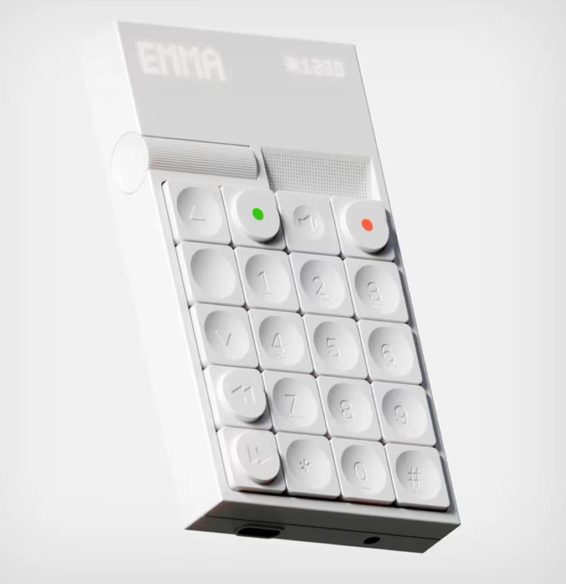
A grooved scroll wheel on the left edge acts as the navigation spine of the product, allowing quick leaps across functions or contacts. Directly above the keypad, a perforated speaker grill hints at voice-forward design, while a dedicated loudspeaker button below keeps call ergonomics prominent. Even the decision to mix concave and convex keys feels meticulous—the raised keys likely represent primary actions, while the sunken ones encourage confident thumb-typing and reduce mispresses.
Although Mendjisky doesn’t spell out every function, the design quietly tells its own story. T9-style typing seems implied. Forward/back keys could point to voicemail or simple media controls. The presence of navigation arrows suggests bare-bones menus rather than full apps. The device’s aesthetic leans so strongly into “un-smartphone” territory that its capabilities are intentionally ambiguous—almost philosophical. What do we really need from a phone? And what can be safely discarded?
via Yanko Design
Recent comments