
Microsoft may never resurrect Windows Phone, but the design community continues to imagine what a modern Windows-powered mobile OS could look like. “Windows Astria,” a concept crafted by Reddit user JoeRasp96, reinterprets the legacy of the Lumia era through a markedly different lens: less Metro minimalism, more material sophistication.
The result is an interface that feels less like a piece of software and more like a physical object, shaped by the same industrial sensibilities as contemporary hardware.
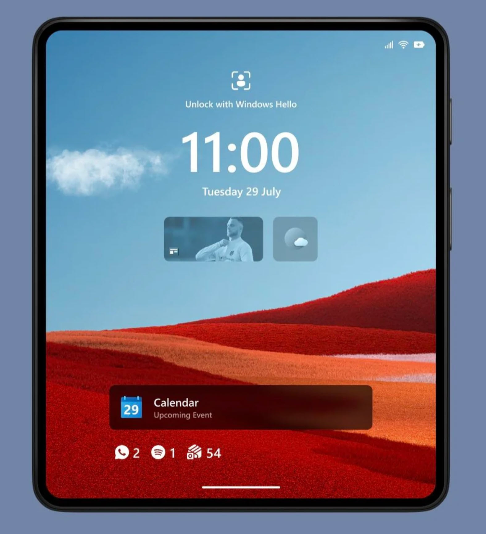
Unlike the rigid, bold blocks of the original Windows Phone, Astria adopts the material vocabulary of Windows 11—Fluent Design and the Mica effect—to create a UI that behaves like layered glass surfaces rather than painted tiles. It is an aesthetic pivot from geometry to atmosphere. The interface breathes, using blur, translucency, and soft gradients not as decoration but as structural components, defining depth and hierarchy in a way reminiscent of architectural glazing.
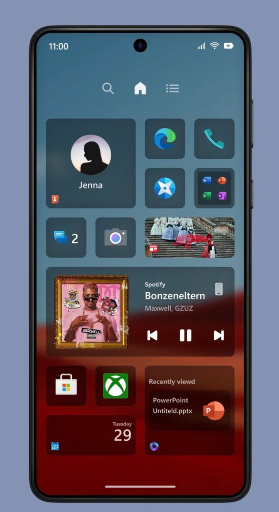
Live Tiles return, but they are no longer monolithic squares. Here they resemble smart, self-contained panels—modular “information surfaces” that act more like dynamic widgets than bold typographic posters. Their motion is restrained and purposeful, tuned to the speed and density of modern screens rather than the dramatic animations of the 2012 era. In Astria, Tiles are not just UI elements; they behave like small physical displays embedded in a larger surface, maintaining coherence even on foldables.
This sense of tactility is reinforced by the softened iconography. Edges are gently rounded, icon fills are matte instead of glossy, and spacing is generous. The layout echoes the calm rhythm of modern industrial design—think Surface hardware, ThinkPad keyboards, or Dieter Rams–era Braun products—where functional clarity emerges from the absence of visual noise.
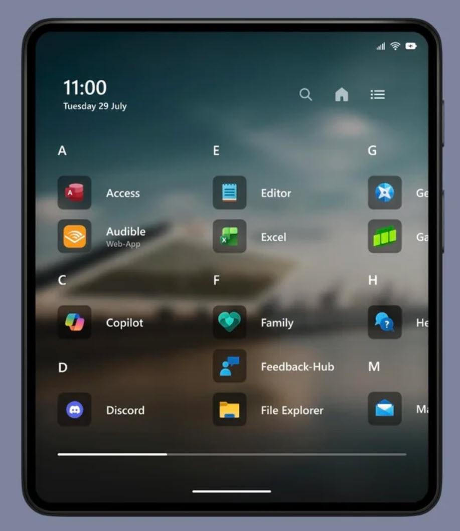
When unfolded on a larger display, the UI scales like a modular interior. Widgets expand into dashboard-like clusters, navigation icons spread into balanced anchor points, and blurred backdrops stretch to create a sense of room-like depth. Nothing feels simply “bigger”; it feels re-composed, as though each layout is individually crafted.
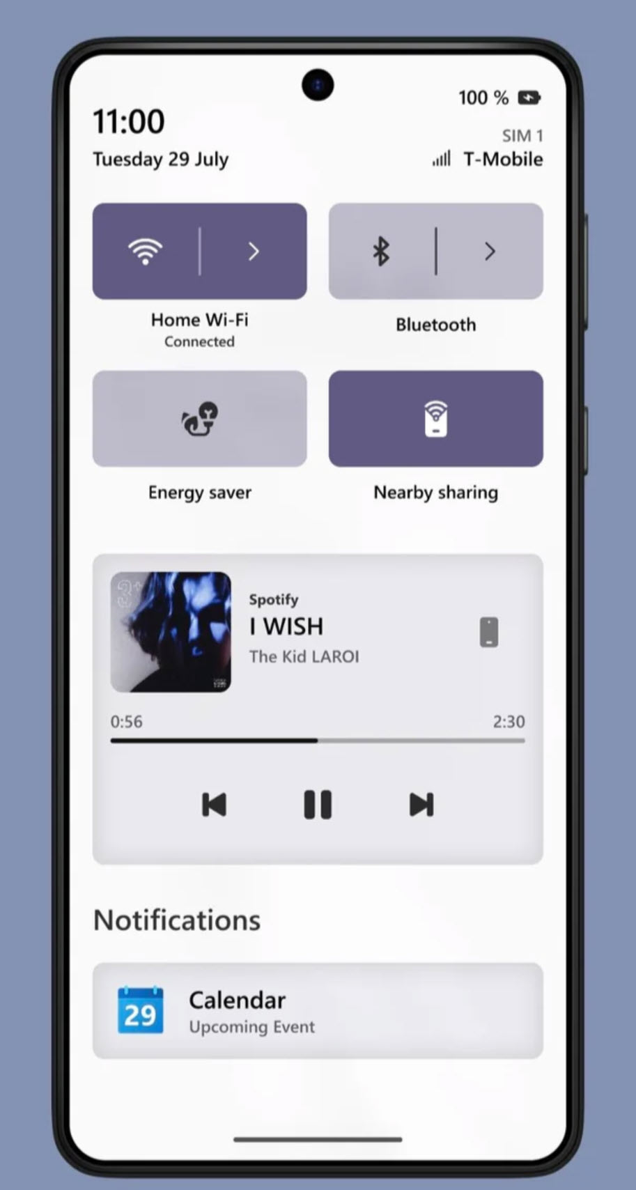
Quick Settings, Notifications, and App Drawer all follow the same spatial logic: large touch zones, floating cards, and subdued translucency. Every surface appears to be cut from the same material slab, a hallmark of industrial design coherence.
The conceptual strategy behind Astria is just as interesting: solving Windows Phone’s historical app-gap by adopting native Android app execution via a WSA-like layer. While technical, the idea fits neatly within the design brief. The UI proposes a platform that is both visually singular and functionally inclusive, merging Microsoft’s material system with the universal availability of Android software. It suggests a future where OS identity is defined not by exclusivity, but by the ability to curate and elevate experience.
via Reddit

Recent comments