

 (8 votes, average: 2.75 out of 5)
If you’re like me and feel that Windows 10 Mobile could have been better, you must absolutely watch the concept video below. It’s a Windows 10 Mobile concept, that’s supposed to fix everything wrong with the OS. This is the creation of Hamid Parham, who did a fine job with this UI design.

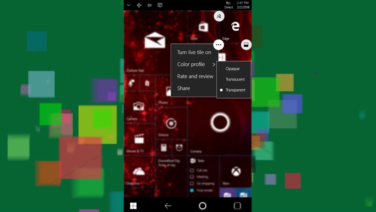
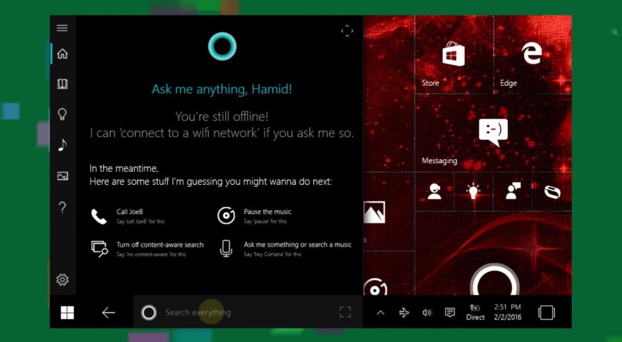
Gaps between tiles are now tighter and you can tweak color profiles of tiles, with options like translucent or opaque. We’ve got a side window, acting like a bit of the Start menu on the go and with an extra option section opening on top of the homescreen. The notification area hasn’t changed in a huge way and we also get the Quick Settings kept at the top.

There’s a lot of transparency in the UI and a lot of options to activate it and put it to work, for background and menus. I like the way the folders and internal storage are organized, but I feel that this lite/minimalistic approach may feel a bit antique to fresh and young users. There’s so much gray in the background and the white icons are way too abstract.
Apple is kind of doing the same in Safari, but somehow their approach makes more sense stylistically. I see a lot of swiping to the side, multiple desktops and a flowing horizontal collection of menus. Keep in mind that the core, the basic definition of Windows 10 Mobile hasn’t changed, so the concept is all bout the finer details.
What do you think?


[via mspoweruser]
Recent comments