
There’s something undeniably magical about iridescence. Maybe it’s the way colors shift with your gaze, like soap bubbles catching sunlight or the back of a beetle shimmering in hues that seem too perfect for nature. The team behind this Nothing Phone (3a) Community Edition concept clearly understands that magic — and they’ve bottled it up in one of the most visually arresting smartphone designs we’ve seen in years.
Designers Naorem Arlex and Vivek Mahajan are the creatives responsible for this eye-catching remix of the Phone (3a), called “Carpe Diem.” Their entry into Nothing’s open design competition is a fusion of nostalgia, material experimentation, and clever user-centric features — all wrapped in a look that feels pulled from a future where tech is both expressive and alive.

From a hardware perspective, the base Phone (3a) stays the same, but what Arlex and Mahajan have done is reimagine the external shell with a laser focus on material storytelling. The standout detail is the use of CD-like iridescence layered over the camera bump and glyph elements — a clear nod to early-2000s tech culture, updated with a refined pastel palette that transitions between soft teal, rose, lilac, and cyberpunk cyan.
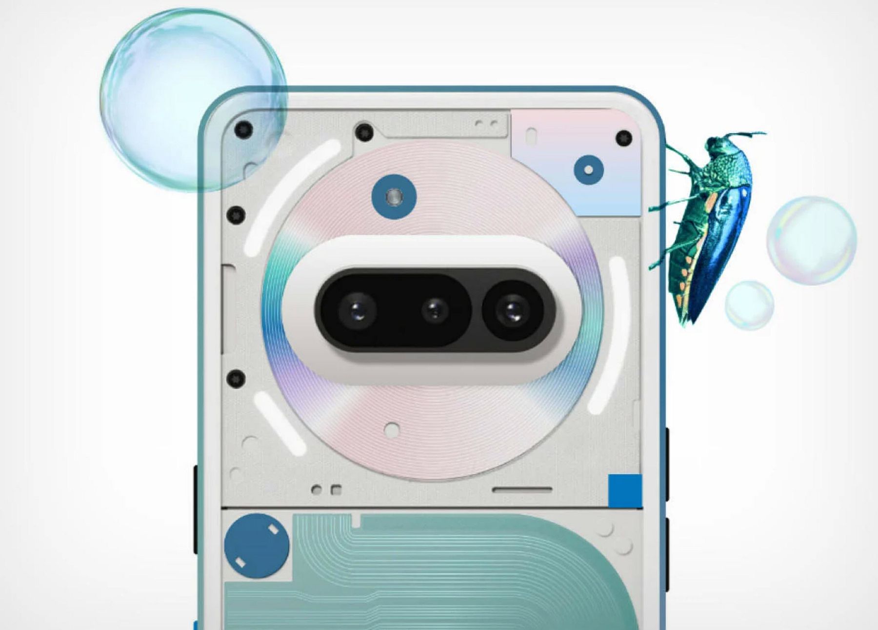
Each surface feels deliberate, every visual layer reminiscent of translucent electronics from the iMac G3 era, only now evolved with a sense of future craft. The design team’s decision to keep the glyph layout intact while enhancing the lightplay is a move that shows respect for the original DNA of the Nothing aesthetic, while still pushing boundaries.
A Heatmap That’s Also Art
Perhaps the most clever part of this concept isn’t just how it looks — it’s how it responds. A unique strip on the back of the phone acts as a visual heat indicator, shifting its color based on the phone’s internal temperature. Under normal use, it remains cool-toned. Push the processor a bit harder — say, while gaming or charging — and the panel subtly morphs into warmer reds and purples.
Not only is this functionally brilliant (giving users passive thermal feedback), it’s also aesthetic AF. It rethinks thermal management as a visual feature, blending design and function in a way we rarely see in phones anymore.
A Spectrum of Editions
The concept comes in three primary visual styles, all playing with color psychology and layering:
- Calm Indigo & Soft Green: Muted and meditative, almost like wearing tech as jewelry.
- Vintage Purple & Cool Blue: A more playful, dreamy vibe—reminiscent of vaporwave tapes and Tokyo sunsets.
- Retro Teal & Energetic Blue: A sharper, gamer-adjacent scheme that still leans into that early-aughts futurism.
The designers also leaned into high-contrast fasteners, deliberately exposing screws and hardware to emphasize the “honesty” of the construction — a page right out of Dieter Rams’ and Jony Ive’s design philosophies.
via Yanko Design
Recent comments