Nubia’s upcoming foldable duo doesn’t just expand the company’s portfolio — it signals the birth of a more mature, intentional design language. These newly surfaced renders, shared by Evan Blass, reveal two devices built on opposite form factors but connected by a surprisingly cohesive aesthetic. For a brand historically known for gamer-centric RedMagic devices and minimalist glass slabs, this pairing marks an intriguing shift.
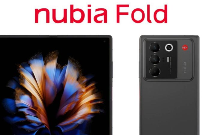
Nubia Fold: Geometry and Structure Take Center Stage
The Nubia Fold arrives with an almost architectural presence. The front display, when unfolded, sits inside a perfectly rectangular frame, with edges that are intentionally neutral — neither aggressively chamfered nor overly softened. It’s a design that lets the display speak for itself, emphasizing the uninterrupted canvas that an 8-inch foldable panel invites.
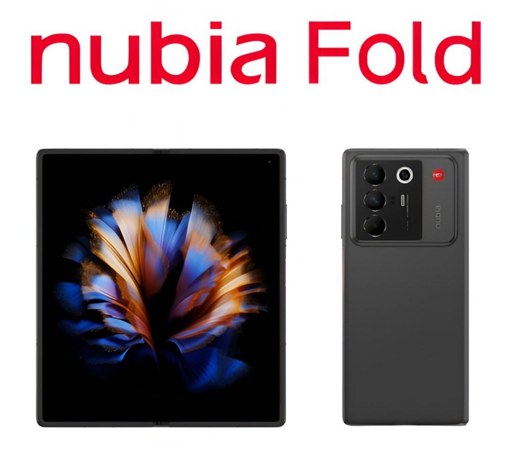
Where the device becomes more expressive is on the back. The camera module takes up substantial real estate, but instead of chasing thinness or minimalism, Nubia embraces structure. The module emerges as a raised panel-within-a-panel, giving the rear surface a tiered topography reminiscent of rugged industrial equipment rather than ultra-polished flagship phones.
Three large lenses are aligned vertically, each housed in its own circular well, joined by an offset flash and a small red accent that immediately draws the eye. This is Nubia leaning into an identity: functional, mechanical, unapologetically geometric.
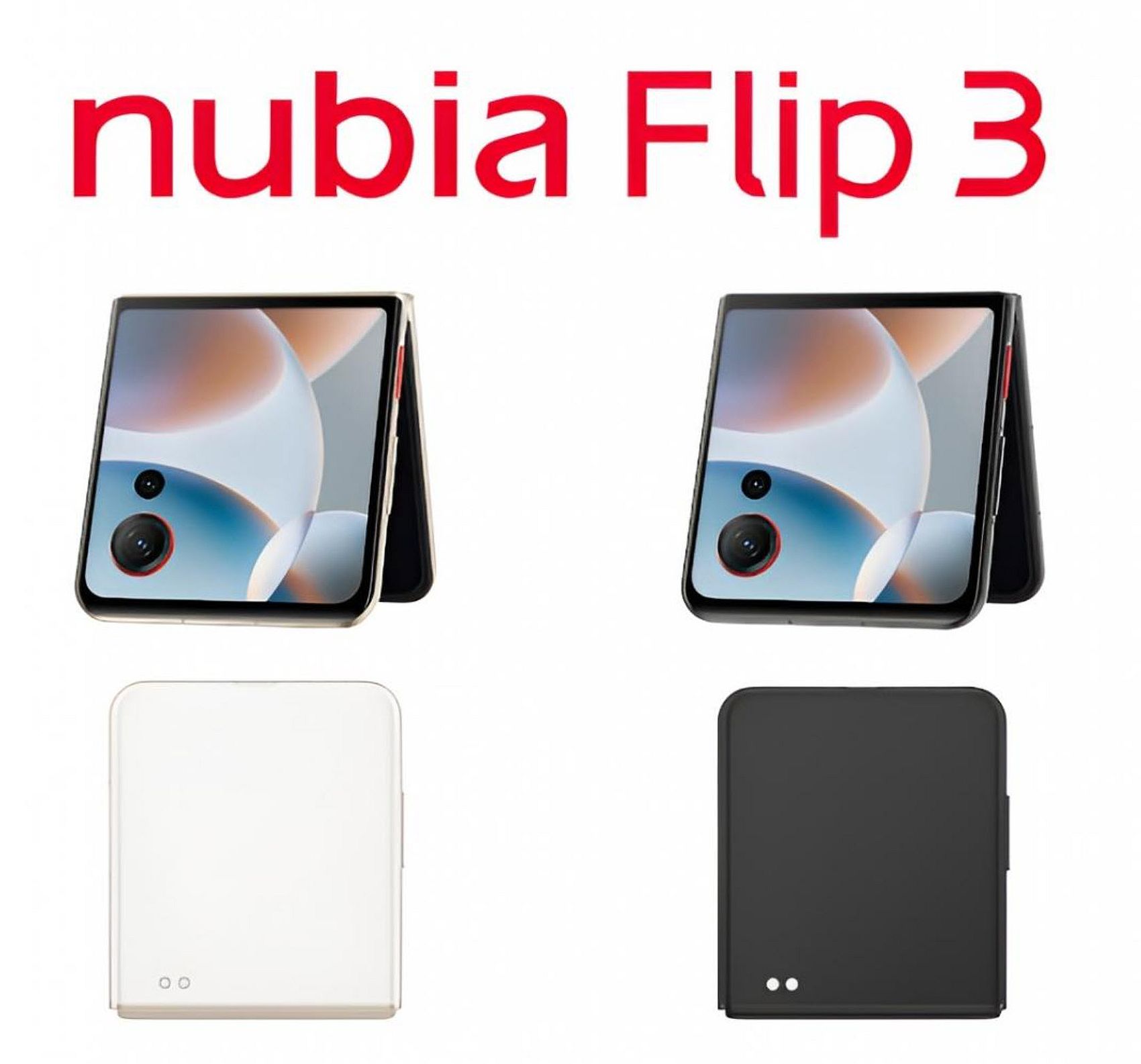
Nubia Flip 3: A Compact Foldable With an Intentional Simplicity
If the Fold is expression through structure, the Flip 3 is expression through restraint. Its external cover display is a perfect square, and unlike the playful UI-driven shapes on the Motorola Razr or the round display experiment on the original Nubia Flip, this panel anchors the design through symmetry and proportion.
The camera cutouts — one large, one small — interrupt the square in a bold, asymmetrical gesture. Combined with the thin metallic frame and minimal visual clutter, the Flip 3 feels closer to modern minimalist industrial design than its predecessors. There’s a clarity to it: a sense that Nubia wants the device to feel like an everyday object rather than a novelty.
The back of the device reinforces this. In both white and black variants, the exterior surface is intentionally blank — almost shockingly so — with just two tiny circular contact points at the bottom. It’s a design decision that reads like a confidence move: the phone doesn’t need texture or pattern to stand out. Its form is enough.
A Shared Visual DNA
Despite their different roles, the Fold and Flip 3 share subtle design cues that suggest Nubia has begun constructing a unified aesthetic system:
- Emphasis on geometric purity: squares, rectangles, and clean edges dominate both designs.
- Camera modules that are bold but structured: the Fold uses a multi-tier slab; the Flip 3 embeds its lenses directly into the cover display area.
- Minimal exterior ornamentation: especially on the Flip 3, surfaces remain intentionally clean.
- A focus on mechanical identity: neither device tries to hide its hinge mechanisms or structural considerations — instead, they visually accommodate them.
Unlike Samsung, which has spent years refining its foldables toward slimmer silhouettes and softer lines, Nubia takes the opposite approach: it embraces the character of mechanical devices, and in doing so, introduces a refreshing alternative.
via Mobilissimo.ro
Recent comments