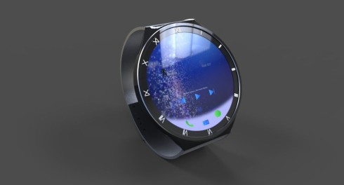
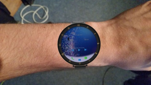
So, it’s Jermaine Smit’s turn to imagine the iWatch and he does it in style. Judging by one of the pictures, this model is partly transparent and it may well include a sapphire glass round screen or two. By the way, all these shots are demos and not the finalized design, but the first one below is closest to completion.
I can see here an interesting haute couture item, if you ask me and mostly judging by the roman number engraved on the frame of the watch. The UI is simple, minimalistic and even more flat than iOS 7. This does look like quite a big iWatch, one that’s probably 3 inches in diagonal or more. While it may be round, it doesn’t in any way copy the Moto 360, like two or 3 models I’ve seen recently.
Each time I see a round smartwatch, it’s smaller and smaller, like it’s becoming a feminine accessory. Are people afraid to have a genuine compass on their hand? There was a trend at some point to wear a sort of belt around your wrist, with a huge watch on it. Where has that gone and why are we going feminine today? Luckily Jermaine Smit isn’t taking that road and he’s going with bigger and bolder.
[Thanks Jermaine]


Recent comments