


 (4 votes, average: 3.50 out of 5)
I’ve seen, heard and followed dozens of tech events this year, but the one that lacked the most hype and was the fastest erased from collective memory was the Microsoft Surface one in early October. It was actually a major event, that finally made the “Surface Phone” real, as the Surface Duo. There are still people who want a different approach, such as designer Cade Lin.
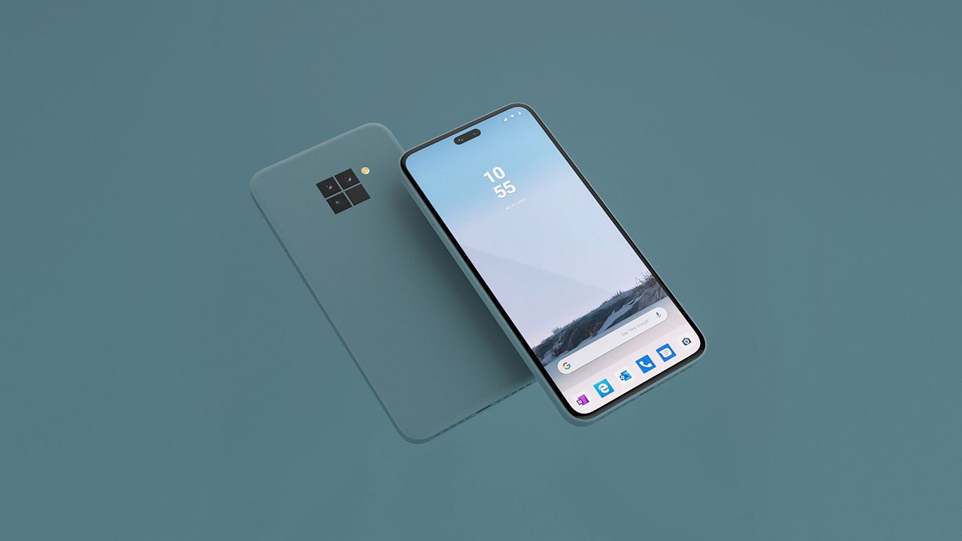
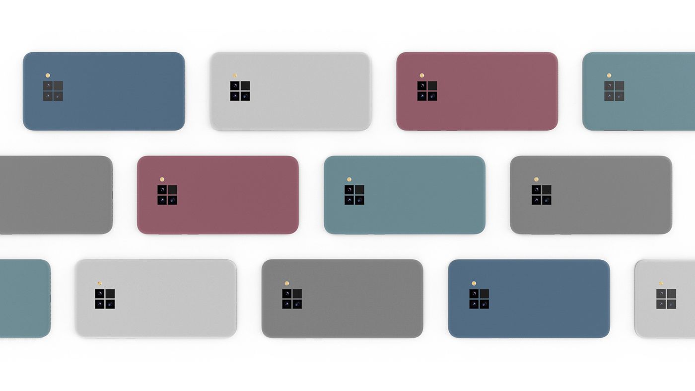
He created the Microsoft Surface Phone Concept, posted on his Behance account. He went with an approach that’s not totally different from the Microsoft one, albeit more elegant and minimalistic. Also, unlike the Surface Duo, here we can actually see the square camera at the back side. A stroke of genius is the fact that the square camera is actually shaped like the Microsoft logo.
The front camera seems to expand on the Galaxy Note 10 selfie cam, making it a tad wider and keeping it centered. The minimal aesthetic of the Surface lineup is kept and also the sleek rectangular and rounded approach. The facade and accented sides feel a bit like a Pixel phone, to be honest. Somehow I’m digging this Microsoft phone design more than the Surface Duo or even the iPhone 11 Pro Max.
However, the texture of the back feels quite a bit like plastic, or maybe a rubberized case. It needs to feel like matte glass or metal, somehow… since I bet it’s made of magnesium, typical for a Surface device. Also, nice UI on top of Android, with a special bar for Microsoft apps. I imagine it’s a launcher of sorts.
[via Behance]
Recent comments